Inward Blog
Viewing entries tagged with 'google'

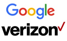
Two Top Marketers Update Their Brand Logos – You’ve Got To Wonder “Why?”
September 8, 2015
Last week both Google and Verizon each unveiled a redesigned logo that opts for a simpler, cleaner look. Verizon is now written in a small, black font next to a thin, red check mark. The day before this announcement, Google introduced its own new logo with a thinner font that could be read on smaller mobile devices.
Posted by Allan Steinmetz at 11:00am
