Two Top Marketers Update Their Brand Logos – You’ve Got To Wonder “Why?”

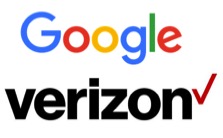
Last week both Google and Verizon each unveiled a redesigned logo that opts for a simpler, cleaner look. Verizon is now written in a small, black font next to a thin, red check mark. The day before this announcement, Google introduced its own new logo with a thinner font that could be read on smaller mobile devices.
According to a Verizon blog, “The cleaner logo is meant to invoke an image of simplicity, honesty and joy in a category rife with confusion, disclaimers and frustration. It's a cleaner, more human design and the check mark, the universal symbol for getting things done, uniquely expresses the reliability of Verizon," the company said.
Google launched its new logo after the company announced a huge restructuring effort that will split the search, advertising, and Internet giant into several different organizations. The new Google is showing off a new identity. The iconic four colors and "Google" over a white background remains unchanged, but the font is significantly different, removing the serifs that have been part of the letters for years.
My question is, “why is it necessary to change a highly recognized and entrenched logo when a company makes a restructuring/organizational change or hires new marketing leadership?” I have always advocated that in order to convey the proper brand meaning and identity, a company must align the behavior and attitudes of their people with the brand values in a compelling and convincing way so that they can personally provide better customer experiences. One has to wonder whether this is the case for Verizon and Google? How does a logo redesign promote behavioral change and employee engagement?
In my humble opinion there was nothing wrong with either of these brand logos that required updating. I have no idea how much money was spent in researching and articulating the new brand look/feel, but I have to wonder whether or not it was money well spent. In many of our conversations with clients, one consistent impediment to employee engagement programs is budgetary restrictions.
The real opportunity that both these companies have now, is to effectively communicate with their employees why the change was necessary and what the new look represents and brand values and new behaviors that ultimately have an impact on customer experience. In today’s business environment, as organizational budgets are stretched between a variety of projects and campaigns there must be real value internally/externally than just a new look. With that in mind, changing the logo for it’s own sake is a waste of money. Changing a logo to convey a transformative moment for company that suggests a new direction is time and money well spent. Furthermore, programs specifically designed to inspire and engage employees will have a much greater return than a slightly sleeker logo.
What is your opinion of the new logos? Please share your thoughts with us.
